Bask
When Bask, a European-style cider, was conceived, it aimed to bring the diverse and intricate flavor profiles of European ciders to North America. This dry cider is more than just a beverage—it serves as a gateway to the authentic Basque experience, intended to be enjoyed with friends and loved ones. With its visual language drawing from traditional Basque symbols, Bask's visual identity exudes celebration and warmth. Experience the authentic flavors and lively spirit of Bask, a cider designed to make you feel high-spirited and elated, perfect for savoring life's simple moments.
Year: 2022
Categories: Identity, Packaging, Web
Mentor: Jorge Montero
Photography: Marleah Flajnik
Motion: Kyle Switzer
Year: 2022
Categories: Identity, Packaging, Web
Mentor: Jorge Montero
Photography: Marleah Flajnik
Motion: Kyle Switzer
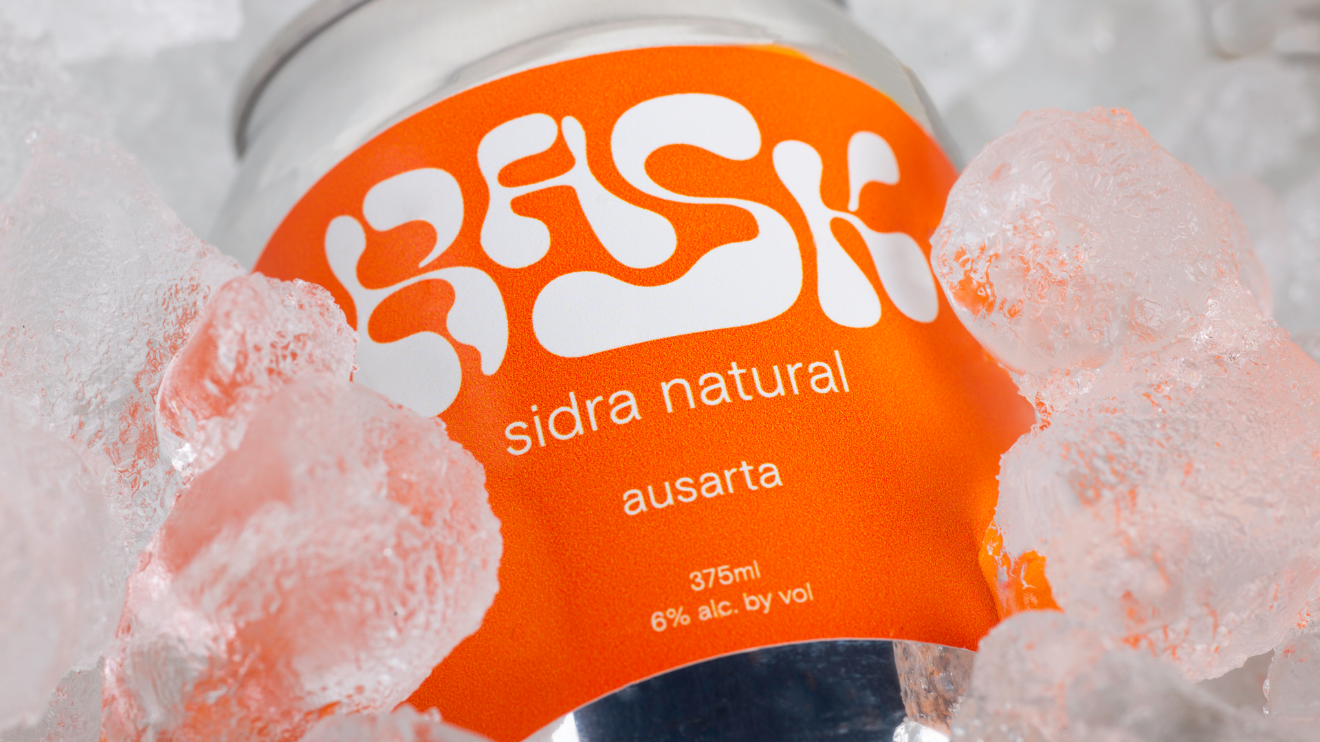
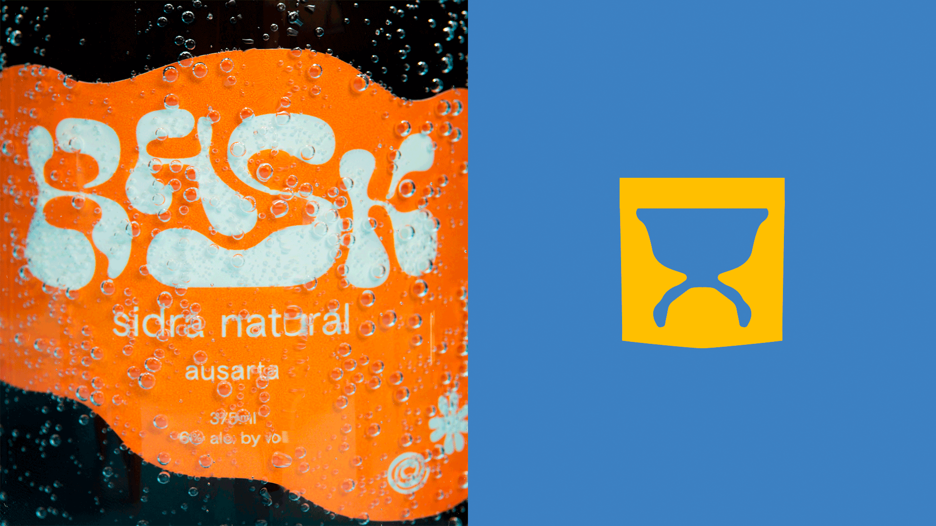
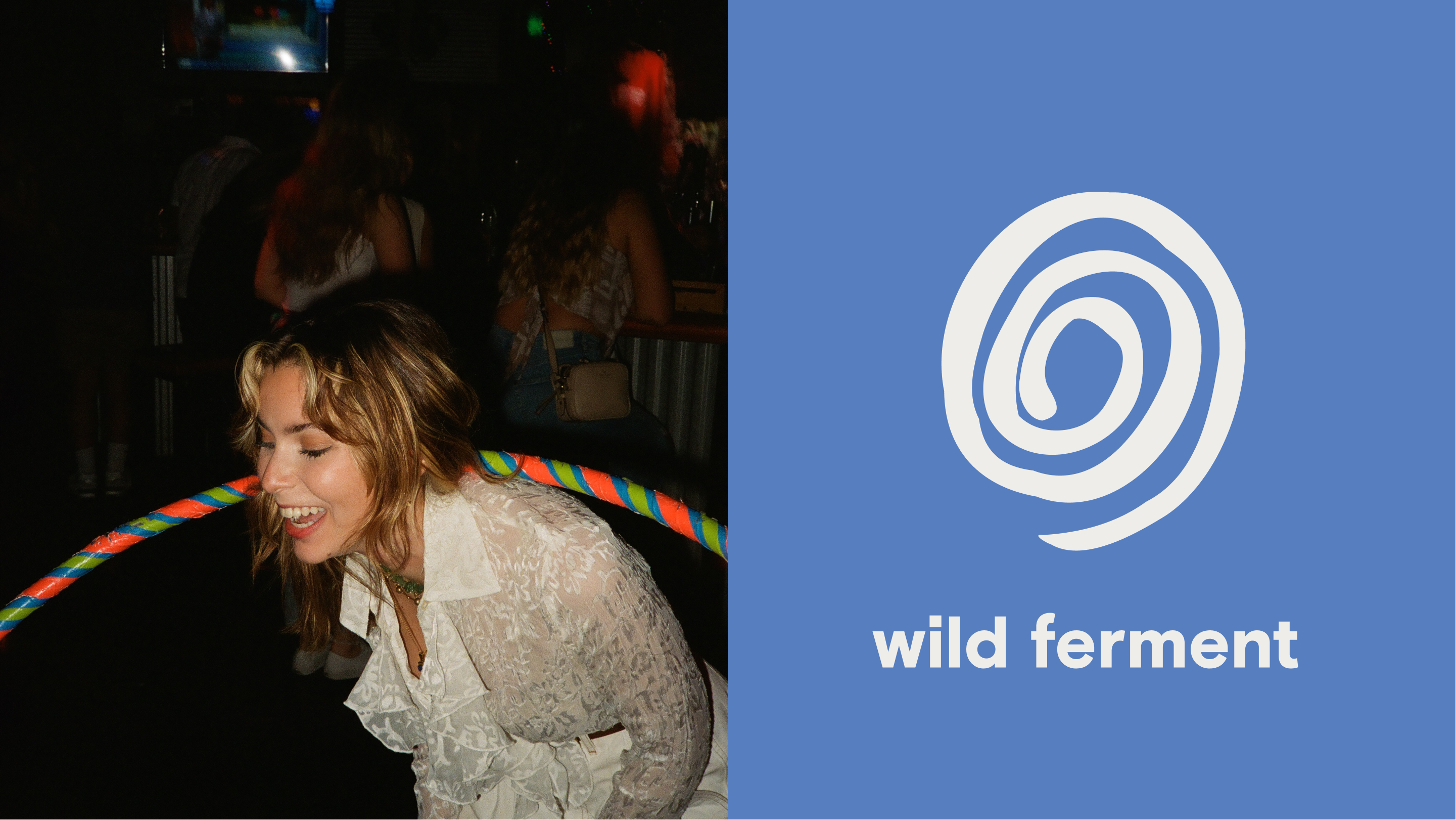
In the world of Basque ciders, complexity, and bold flavors reign supreme. The visual language of Bask draws inspiration from the cider’s flavor profile and the wild fermentation technique used to create it.
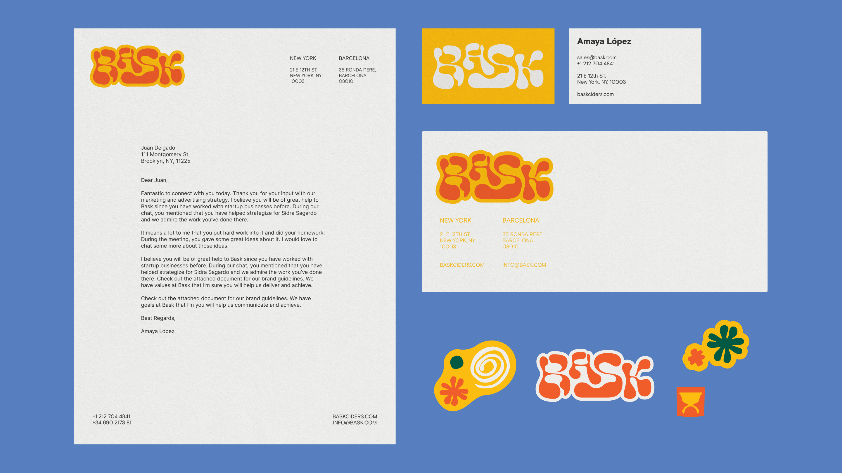
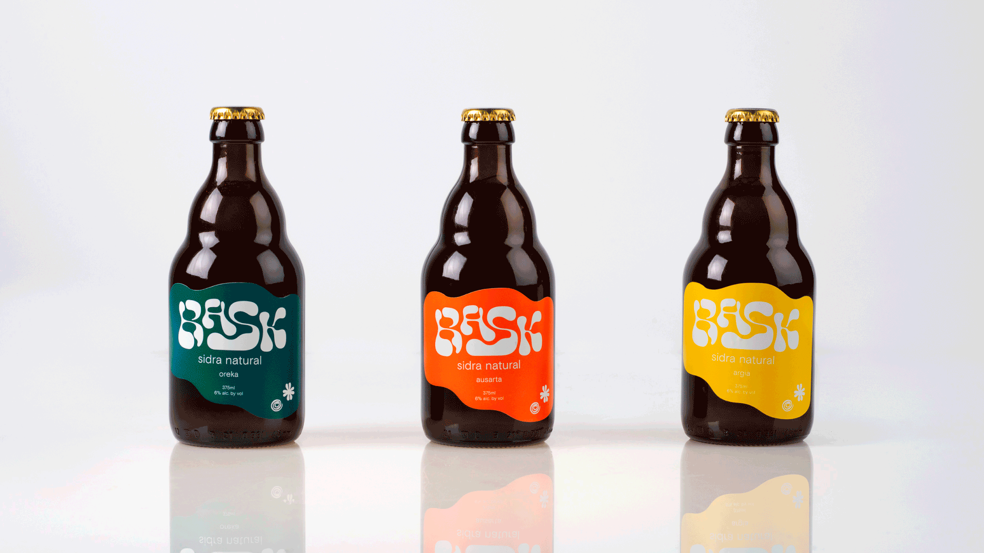

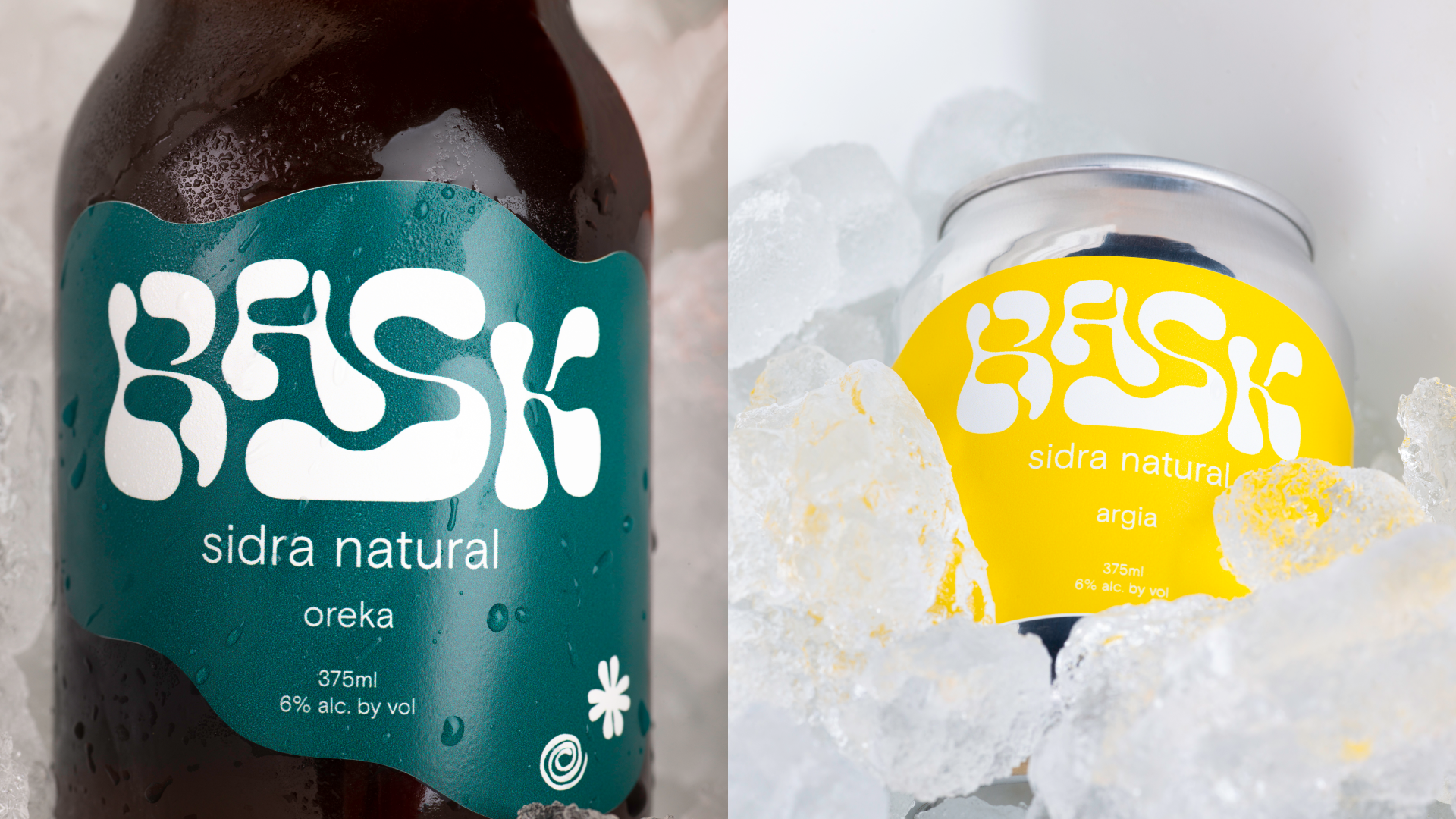
The brand’s shape palette is inspired by Basque artist Eduardo Chillida. Cut paper compositions shape the unique visual palette, while a vibrant color scheme, influenced by the country's geography, takes center stage. The green hue pays homage to the traditional green bottles used for "sidra natural." Hints to traditional Basque symbols, such as the Laburu, find their place within the visual identity, where the national colors of red, white, and green coexist harmoniously. Additionally, the infusion of yellow captures the essence of cider and radiates the warmth so characteristic of the region.

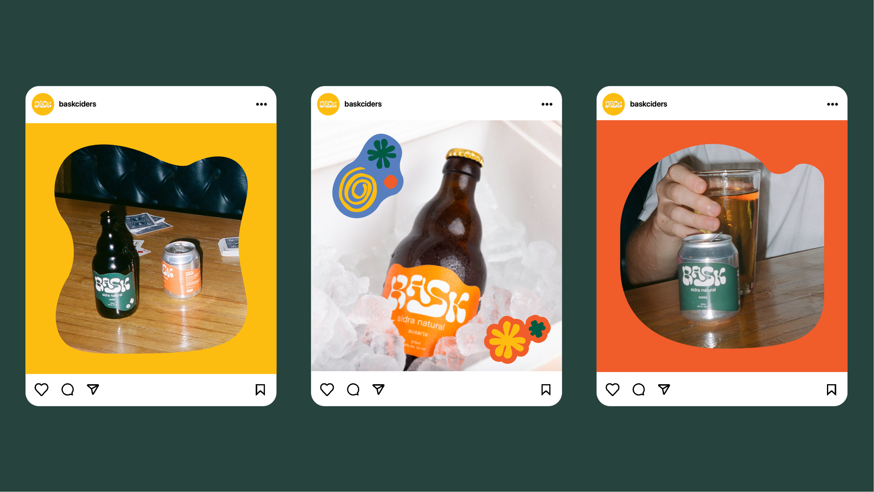
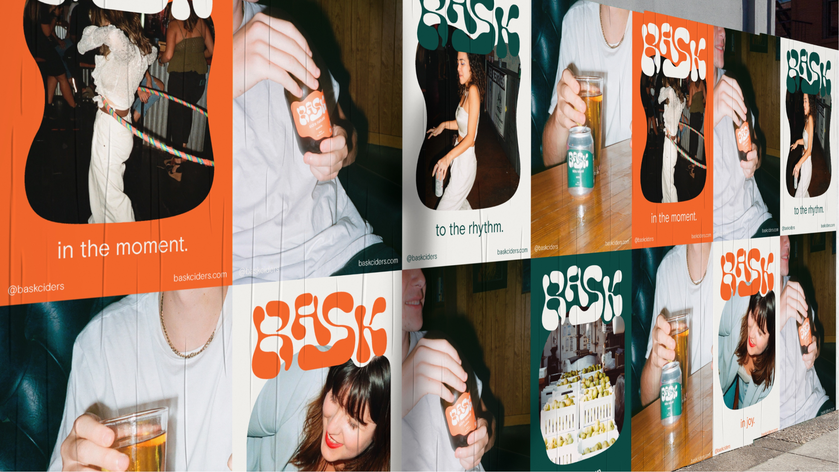
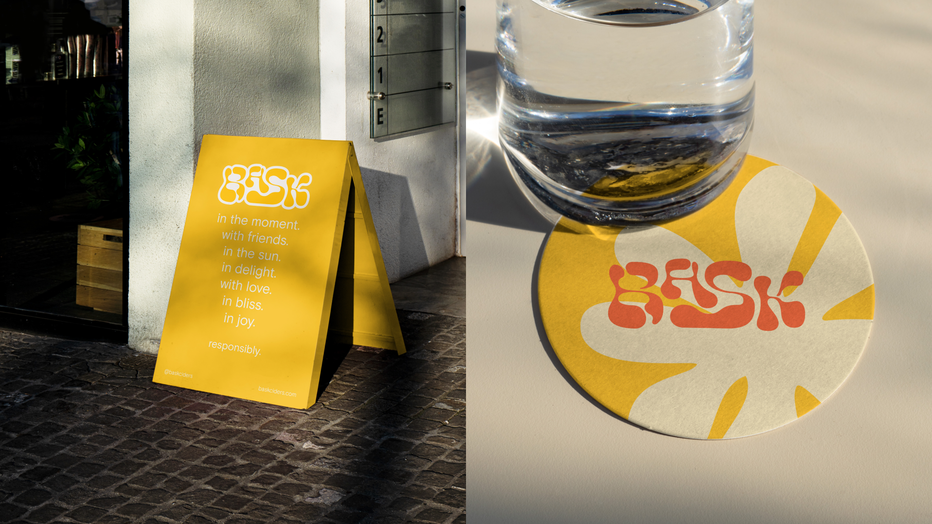
Whether it's a warm day at the beach or a cozy evening by the mountainside, Bask cider elevates your spirits and fills you with elation. Much like the captivating pouring technique used with this cider, Bask aims to entertain and celebrate life's simplest pleasures. With each sip, it invites you to revel in the present moment and relish the joyous experiences that surround you.

The name "Bask" was chosen deliberately, as it signifies the merging of two cultures. The name is reminiscent of "Basque," symbolizing the fusion of traditions and the appreciation of life's uncomplicated moments. Furthermore, it captures the warmth of the sun that graces the Basque coast, infusing the cider with a sense of vitality and radiance.

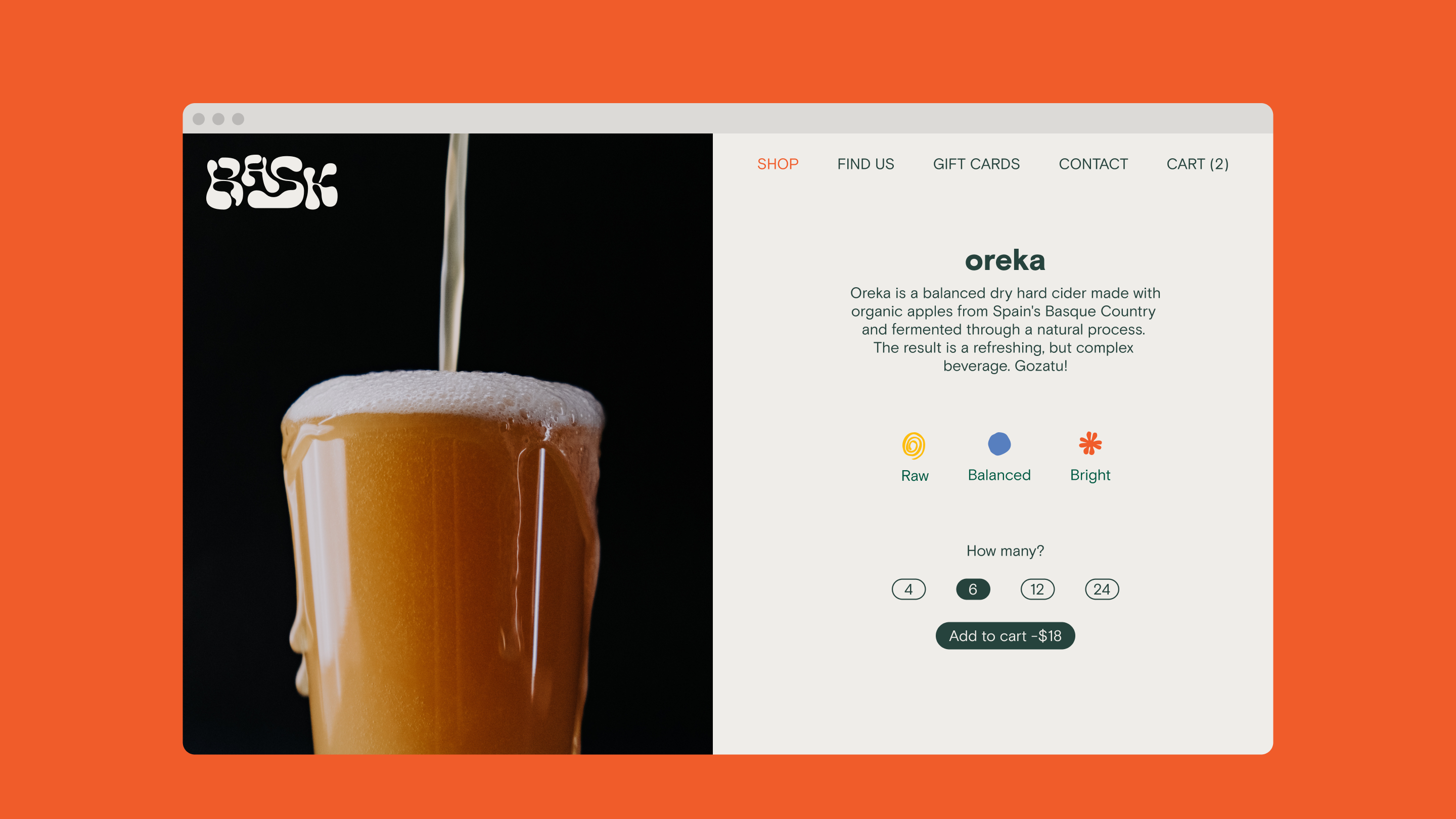
Bask’s e-commerce website offers a seamless and immersive brand experience. Explore the beauty and complexity of European ciders while embracing Basque heritage and celebrating life's simple pleasures. With a spirit of vibrancy, the website invites you to bask in the enchanting world of Bask’s exceptional cider.
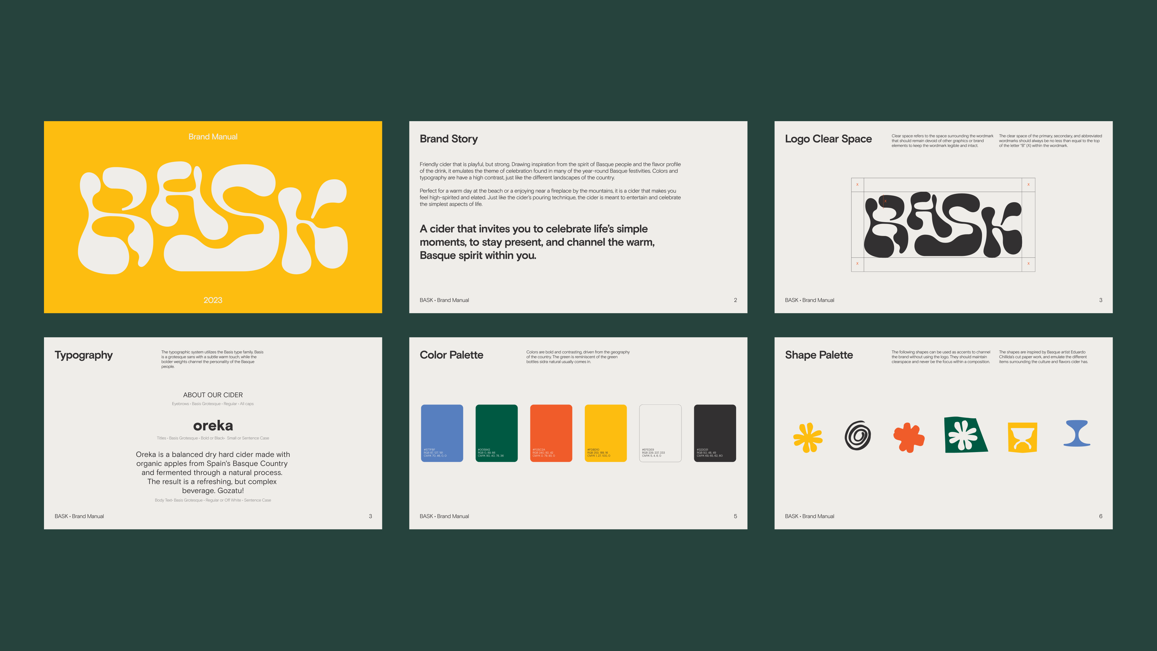
Bask embodies a unique blend of playfulness and strength, mirroring the spirit of the Basque people and the tantalizing taste of the drink itself. It captures the essence of celebration that permeates the year-round Basque festivities. Just as the landscapes of the Basque country boast high contrasts, Bask's visual identity is vibrant and dynamic.
© Maria Sofia Motta. All rights reserved.